Case Study

The refreshed student login page
Overview
Our goal was to refresh the NWEA MAP Growth Student Login page, which had dated graphics and unclear language. My task was to ensure clear and concise UI copy that was consistent across the platform, user-centered, easy to read, appropriate in tone, and in line with our company voice and values. I wrote new copy for several screens as part of a UX writer/designer team.
| Request | Work with a UX designer to consolidate the assessment login screen with assessment and practice test information |
| My Role | UX writer |
| Timeline | 6 months |
| Result | Adoptions |
Process
- Understand project goals
- Review designer draft
- Review word choice, reading level, voice, tone
- Suggest improvements
- Reach consensus with designer
- Release to team for review
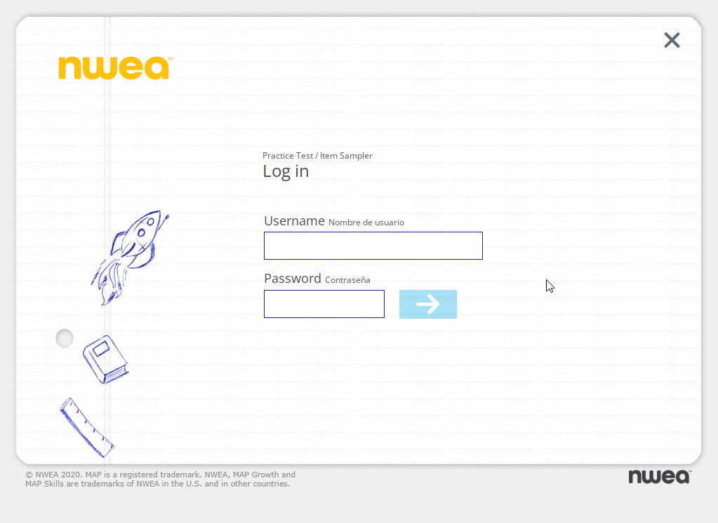
Our starting point
We addressed a microagression
Because we wanted to make users feel safe and supported, we didn’t want to seem to value English more than Spanish. While English was the most commonly used language among our users, we felt that displaying Spanish after English and in a smaller font could inadvertantly send the message that we thought Spanish and its speakers were secondary. To fix this, we added a toggle so that users could choose their preferred language, allowing them to switch between English and Spanish.
We sought to be understood
Realizing that the words “item” and “assessment” were technical jargon and might not be understood by students, we removed the terms. We strove for simplicity in all our word choices, and attempted to write to the lowest grade level possible in order to serve all students.
We wrote microcopy
Following current microcopy practices, we replaced the arrow image on the button with copy indicating the action the user was taking by selecting the button. This streamlined our accessibility checks because instead of us adding alt text to the button image, a screen reader could simply read the button copy.
We used simple sentence structures
Part of our strategy to be understood by the largest number of students was to write short imperative sentences in the present tense and use short, simple words. I didn’t agree completely with all of the approved copy. For example, I didn’t want to use the word “see” to direct students to our resources when some of our users might be vision impaired. I would have prefered to use more neutral language like “find.”
