Case Study – Button Text Design System Writing Guidelines
Overview
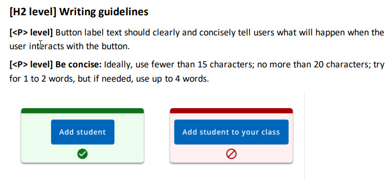
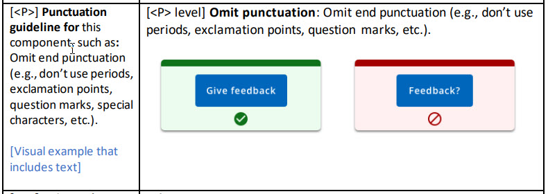
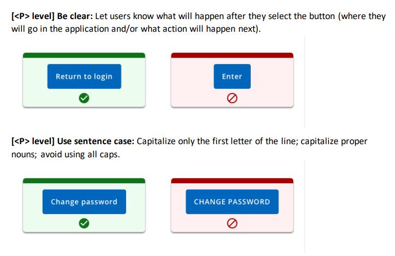
Button text was inconsistent throughout our user interface in terms of content, length, and grammatical structure. Some buttons began with nouns and others with verbs. Sometimes it wasn’t clear where the user would go after following a button. My goal was to create writing guidance that would help our team write user-centered button text.
| Request | Create guidance to help team write clear, consistent, and effective button text |
| My Role | Writer |
| Timeline | 3 weeks |
| Result | Integrated into Design System |
Process
- Review notes from UX Content Collective Microcopy course
- Review online design systems (DS): Google Material Design, Adobe React Spectrum, Salesforce Lightning, Microsoft Ignite, Apple Developer
- Distill guidance; tailor to org
- Review existing DS button section
- Integrate text guidelines
- Use to create template for other component text guidelines
Highlights
 Joanna Hofer